
Building a Winning Product Page That Converts
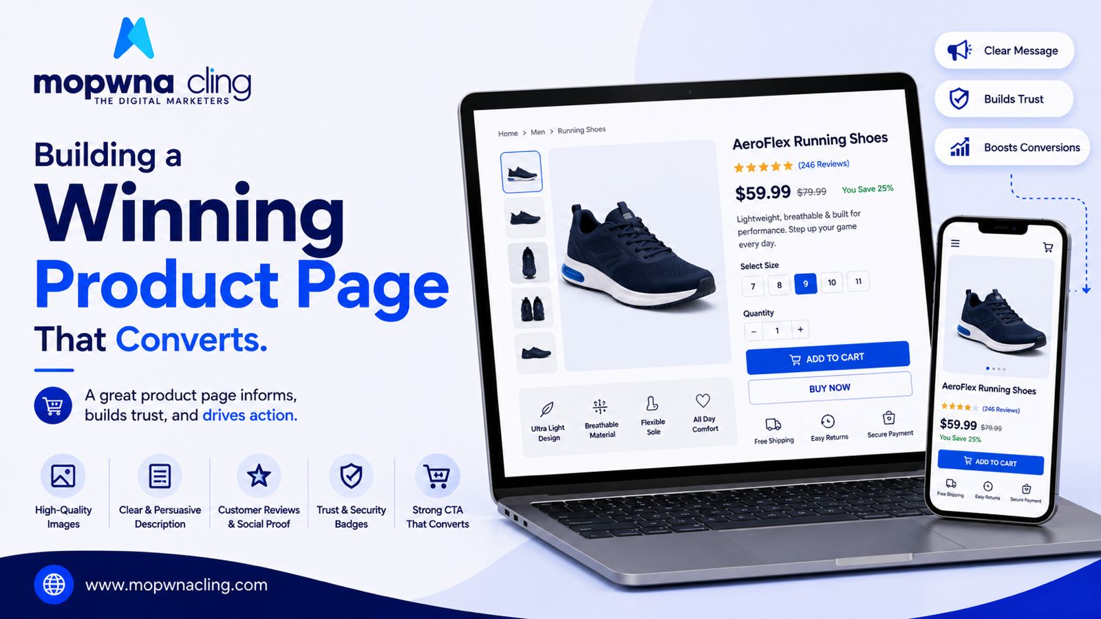
We at Mopwna Cling help you increase your online presence 10x
A product page has one job: answer every question a customer might have before they even think to ask it. The pages that convert best aren't necessarily the prettiest — they're the ones that leave the fewest doubts unresolved.
Photos do more selling than copy
Most shoppers form an opinion within seconds of landing on a product page, and that opinion is shaped almost entirely by the images before they read a word. Multiple angles, a true-to-life color representation, and at least one lifestyle or in-use shot all matter. If your product has texture or detail — fabric weave, packaging design — a close-up shot builds trust that a single hero image can't.
Video is no longer optional for many categories
For apparel, beauty, and anything where "how does it actually move or apply" matters, a short video can lift conversion noticeably more than static images alone. It doesn't need to be a polished production — a simple 15-second clip showing the product in use often outperforms an overly stylized ad.
Write for the hesitant buyer, not the convinced one
Someone who's already decided to buy doesn't read your description carefully. The person who's on the fence does. That's who your copy should be written for — addressing the specific doubts that stop a purchase: does this run small, is the material breathable, how long does shipping take.
Specs matter, but context matters more
Listing "100% cotton" is fine. Explaining what that means for how the product feels or holds up over time is what actually helps someone decide. Specs answer "what is this." Context answers "should I buy this," which is the question that actually drives conversion.
Reviews are doing half your persuasion work
A product page without reviews is asking customers to trust the brand's word alone. Reviews — especially ones that mention specific concerns like fit or durability — do more to close hesitant buyers than almost any other page element. Even a handful of detailed reviews outperforms a large number of generic five-star ratings with no text.
Make the "buy" decision feel low-risk
Clear return policy information, delivery estimates, and any guarantees should be visible without a customer having to hunt for them. Uncertainty about what happens if something goes wrong is a silent conversion killer — most people won't email to ask, they'll just leave.
Don't bury the add-to-cart button
This sounds too basic to mention, but it's a common mistake on pages with long descriptions or heavy image galleries — the purchase button gets pushed so far down or so small that it's easy to miss on mobile. A sticky add-to-cart bar on mobile, visible no matter how far someone scrolls, is a small change that consistently helps.
Test one thing at a time
Changing five elements of a product page at once makes it impossible to know what actually moved the needle. Whether it's the main image, the headline, or the position of reviews, isolate variables so your next round of changes is based on real evidence, not a hunch.
A great product page isn't about flashy design. It's about removing every small hesitation standing between "interested" and "purchased.