
Mobile Commerce: Why Your Store Needs to Be Mobile-First
We at Mopwna Cling help you increase your online presence 10x
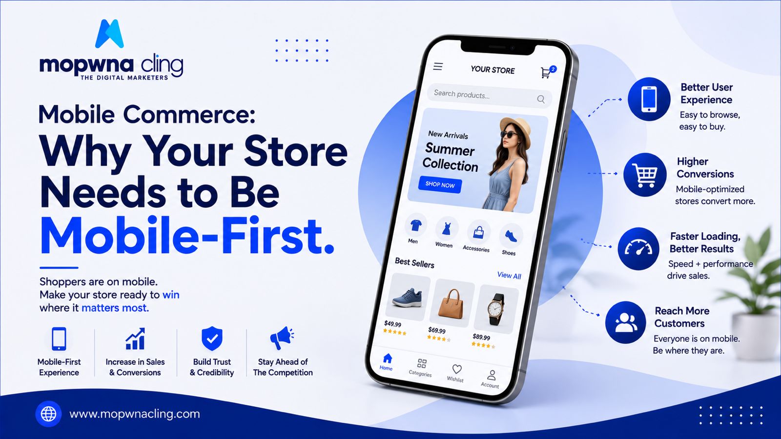
For most ecommerce brands in India, mobile isn't just an important channel anymore — it's the primary one. A majority of traffic and a growing share of actual purchases now happen on phones, which means designing for desktop first and adapting for mobile later has the priorities backwards.
Mobile-first isn't the same as mobile-friendly
A "mobile-friendly" site is a desktop design that shrinks reasonably well. A mobile-first site is designed from the ground up assuming a phone screen, one thumb, and often an inconsistent internet connection — which changes almost every decision, from navigation to image sizing to how much text appears on a screen at once.
Speed matters even more on mobile
Mobile networks are less predictable than home broadband, and patience for slow-loading pages is lower on a phone than a laptop. Heavy images, unnecessary scripts, and bloated themes hurt mobile conversion rates disproportionately compared to desktop. Compressing images and trimming unnecessary third-party scripts is often the single highest-leverage technical fix a store can make.
Navigation needs to be simplified, not just shrunk
A desktop mega-menu with fifteen categories crammed into a mobile hamburger menu is a common failure mode. Mobile navigation should prioritize the handful of categories or entry points that matter most, with search prominently placed for everything else.
Thumb-friendly design isn't optional
Buttons too small or too close together lead to mis-taps, which create frustration and abandoned sessions. Interactive elements need enough spacing and size to be tapped comfortably on a mid-range phone screen, not just a premium device.
Checkout is where mobile friction hurts most
Long forms, small text fields, and payment flows not optimized for mobile wallets or UPI apps cause a disproportionate share of mobile cart abandonment. Autofill support, minimal typing, and native support for mobile-first payment methods make a measurable difference in completed purchases.
Mobile apps aren't necessary for everyone
Building a dedicated app makes sense once a brand has a large, repeat customer base that benefits from push notifications. For newer or smaller brands, a fast, well-built mobile website usually delivers more value per rupee spent than app development.
Test on real, mid-range devices
Most Indian mobile shoppers use mid-range Android devices with less processing power and sometimes slower connections. Testing exclusively on premium devices creates a false sense of how the site actually performs for a large share of the real audience.
Track mobile-specific metrics separately
Blending mobile and desktop analytics together hides where the actual problems are. Look at mobile bounce rate, mobile checkout completion rate, and mobile page load time as distinct metrics.
Mobile commerce isn't a trend to prepare for. For most Indian ecommerce brands, it's already the majority of the business, and treating it as an afterthought means underserving most of your actual customers.
Let's Build Your Brand Together Looking to grow your ecommerce business with smart digital marketing strategies? Mopwna Cling helps brands achieve measurable growth through Performance Marketing, SEO, Website Development, Branding, Social Media Marketing, and Ecommerce Solutions.
Let's Build Your Brand Together 📞 +91 7906544070 🌐 www.mopwnacling.com ✉️ info@mopwnacling.com