
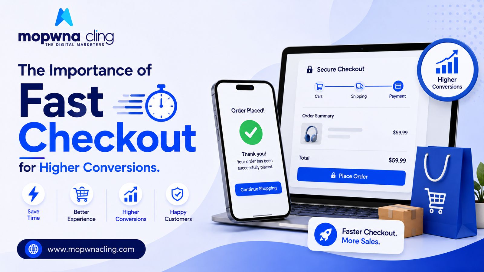
The Importance of Fast Checkout for Higher Conversions
We at Mopwna Cling help you increase your online presence 10x
Every extra step in checkout is a chance for a customer to change their mind. It sounds obvious written out like that, but plenty of ecommerce stores still run checkout flows with five or six steps, forced account creation, and forms that feel like they were designed for a mortgage application rather than a t-shirt purchase.
The cost of friction is bigger than it looks
Studies across the industry consistently show that a large share of cart abandonment happens specifically because checkout is too long or too complicated — not because of price or product doubt. That's the frustrating part: these are customers who already decided to buy. Losing them at the finish line is the most avoidable kind of lost revenue.
Guest checkout should always be an option
Forcing account creation before purchase is one of the most reliable ways to lose a first-time buyer. Yes, accounts help with retention and data collection, but that trade-off isn't worth losing the sale entirely. Offer account creation after the purchase completes instead — most people will do it anyway once they've already committed.
Fewer fields, fewer steps
Every field you ask for is a small decision the customer has to make. Do you really need a company name field, or a separate billing address confirmation, for a simple product purchase? Autofill and address-lookup tools can cut form-filling time dramatically, and every second saved reduces the chance of someone giving up midway.
Show total costs early
Nothing kills a checkout faster than a surprise shipping fee appearing on the final screen. If shipping costs or taxes are going to be added, show an estimate as early as the cart page. Surprise costs at the last step are one of the top reasons people abandon purchases they were otherwise ready to complete.
One-page checkout vs. multi-step — test, don't assume
There's no universal winner here. Some stores see better results with a single scrollable checkout page; others do better with a clear multi-step progress bar that shows exactly how close the customer is to finishing. What matters more than the format is that whichever you choose feels fast and predictable, with no unexpected steps appearing partway through.
Payment options need to match your actual customers
In India specifically, UPI has become the default preference for a huge share of online shoppers, followed by cards and COD. A checkout that buries UPI behind multiple clicks, or doesn't support it at all, is leaving money on the table regardless of how smooth the rest of the flow is.
Mobile checkout deserves separate testing
Don't just assume your desktop checkout "also works" on mobile. Buttons that are easy to tap, forms that trigger the right keyboard type, and minimal scrolling all matter enormously on a small screen, where most of your traffic almost certainly lives.
Checkout isn't the place to sell harder or add more prompts — it's the place to get out of the customer's way as quickly as possible. Every second and every unnecessary click is a small bet against your own conversion rate.
Let's Build Your Brand Together Looking to grow your ecommerce business with smart digital marketing strategies? Mopwna Cling helps brands achieve measurable growth through Performance Marketing, SEO, Website Development, Branding, Social Media Marketing, and Ecommerce Solutions.
Let's Build Your Brand Together 📞 +91 7906544070 🌐 www.mopwnacling.com ✉️ info@mopwnacling.com